
Logo
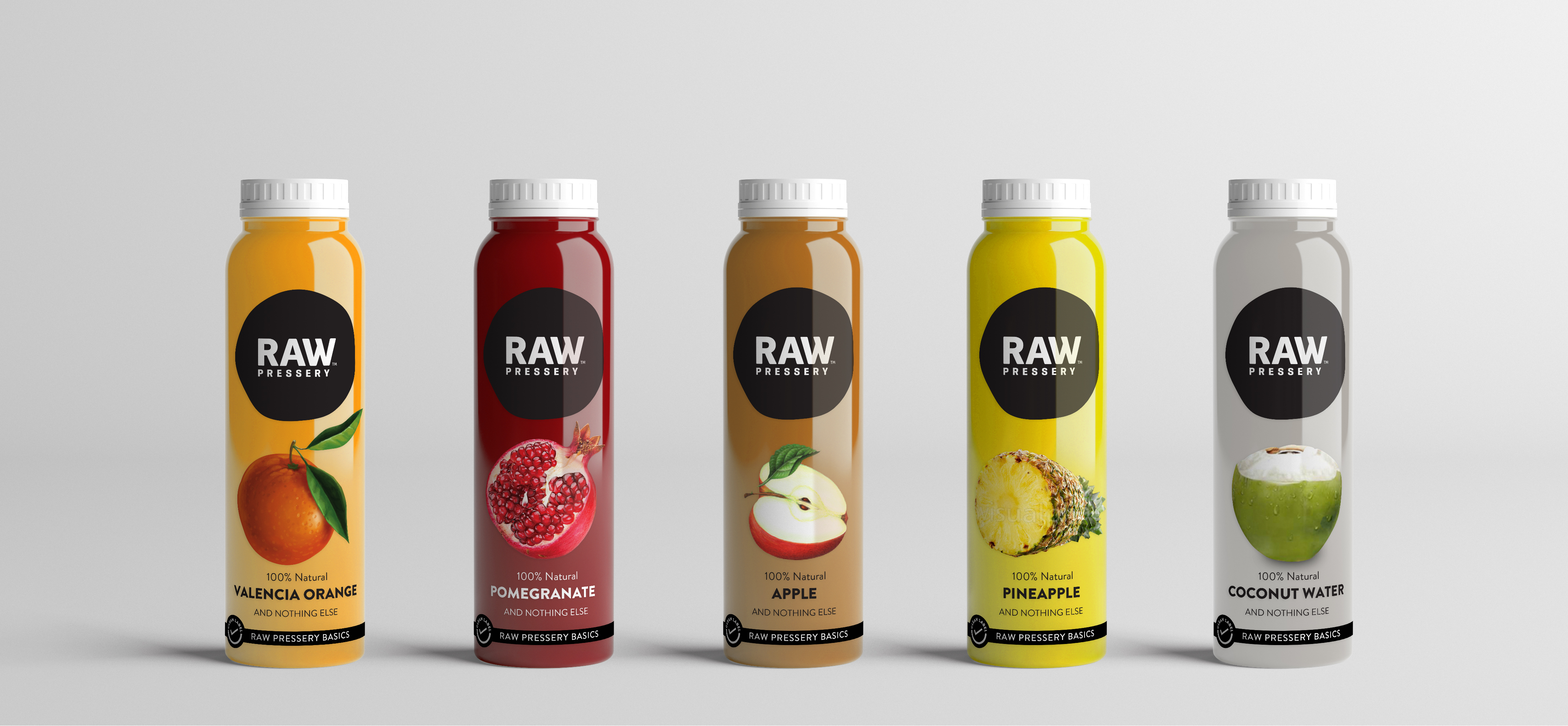
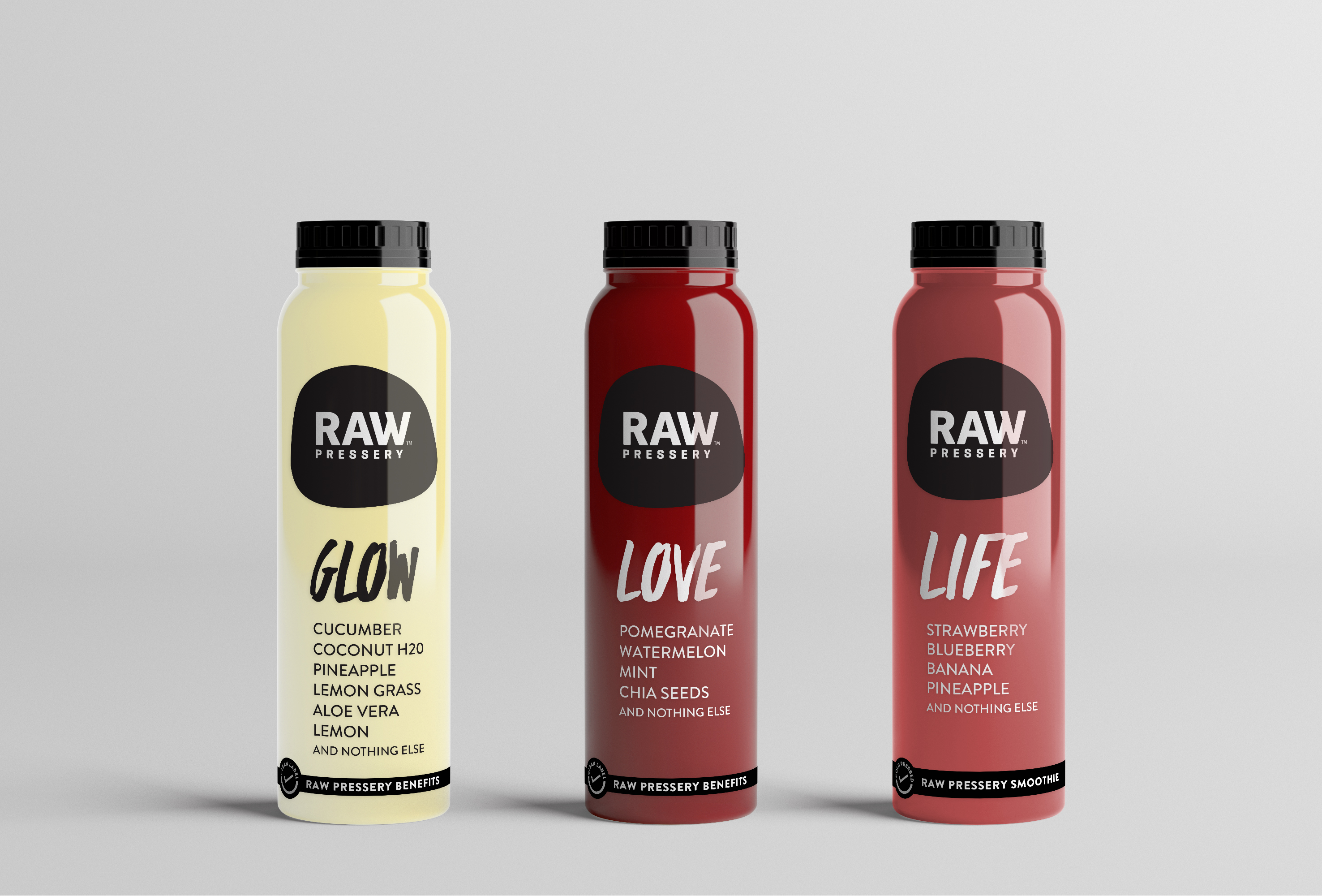
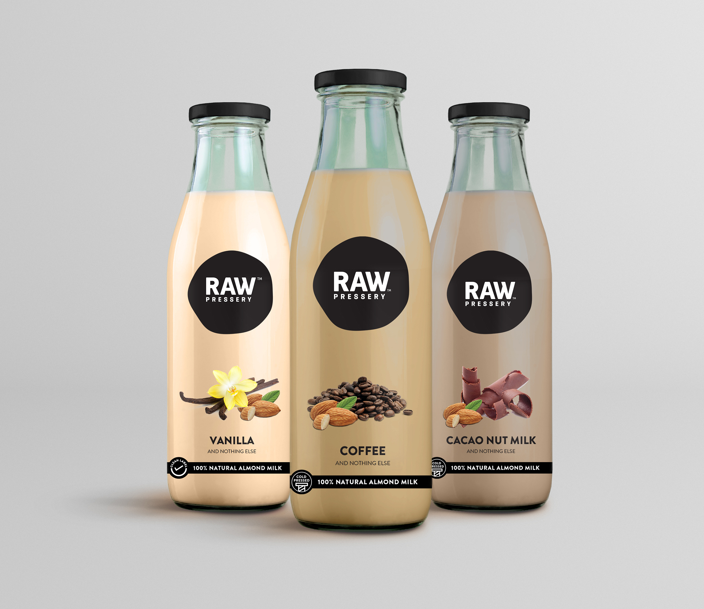
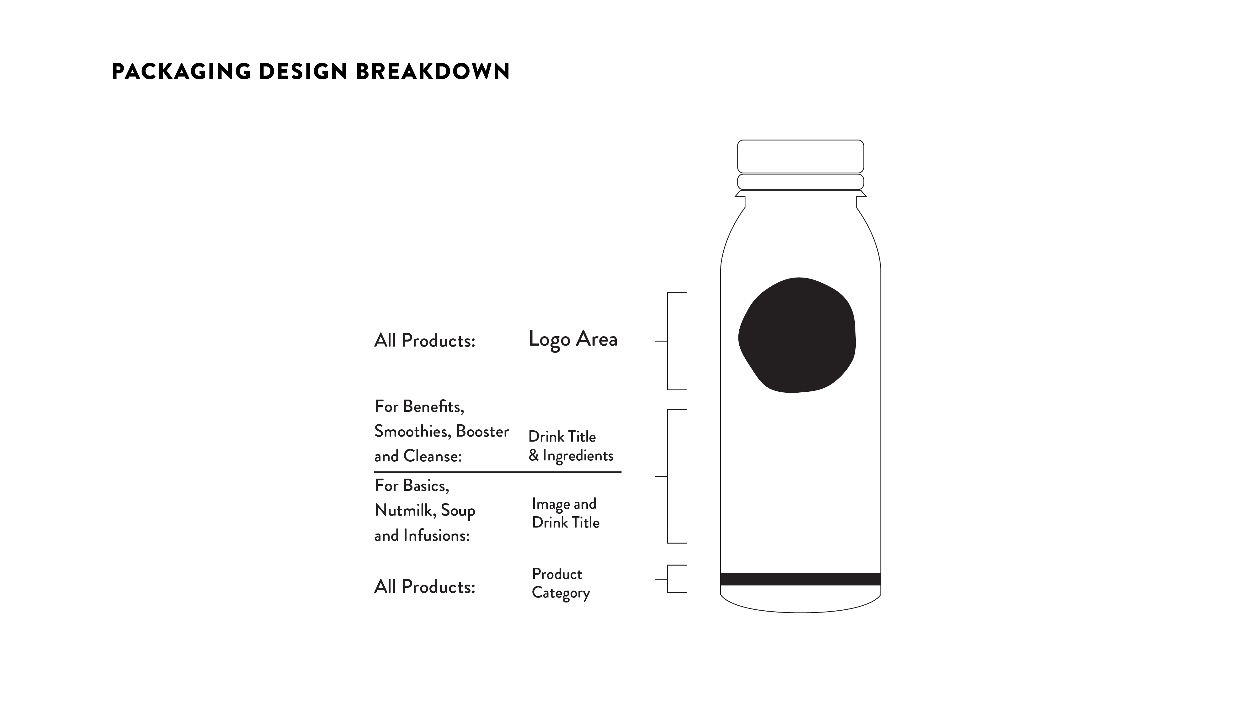
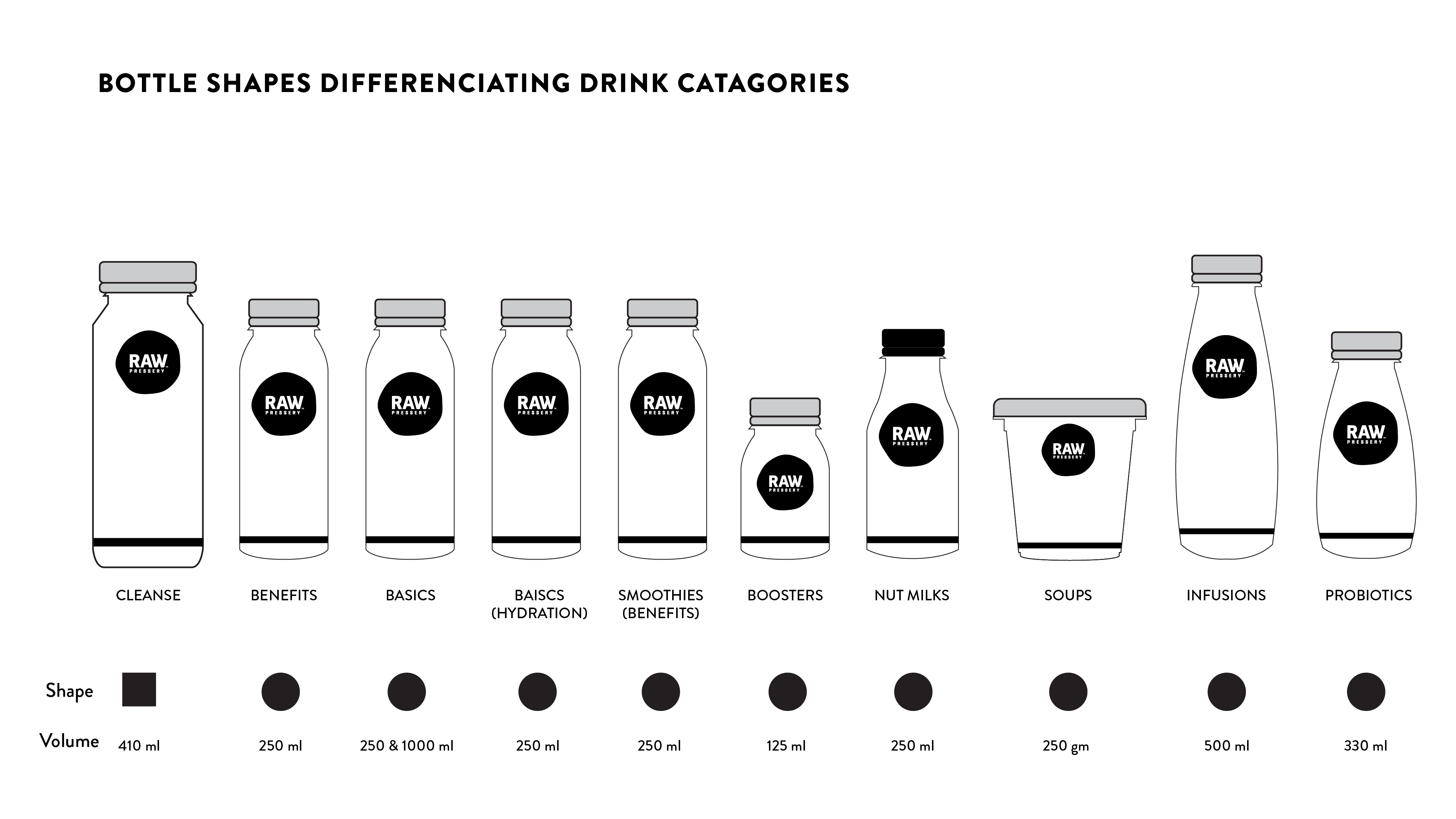
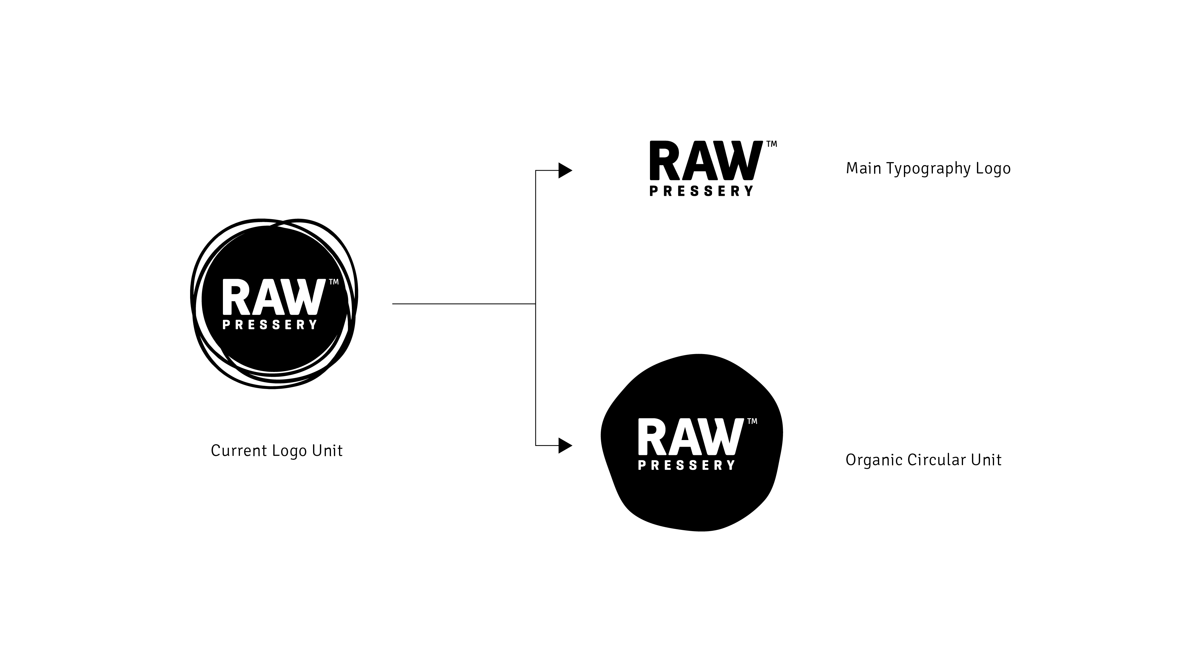
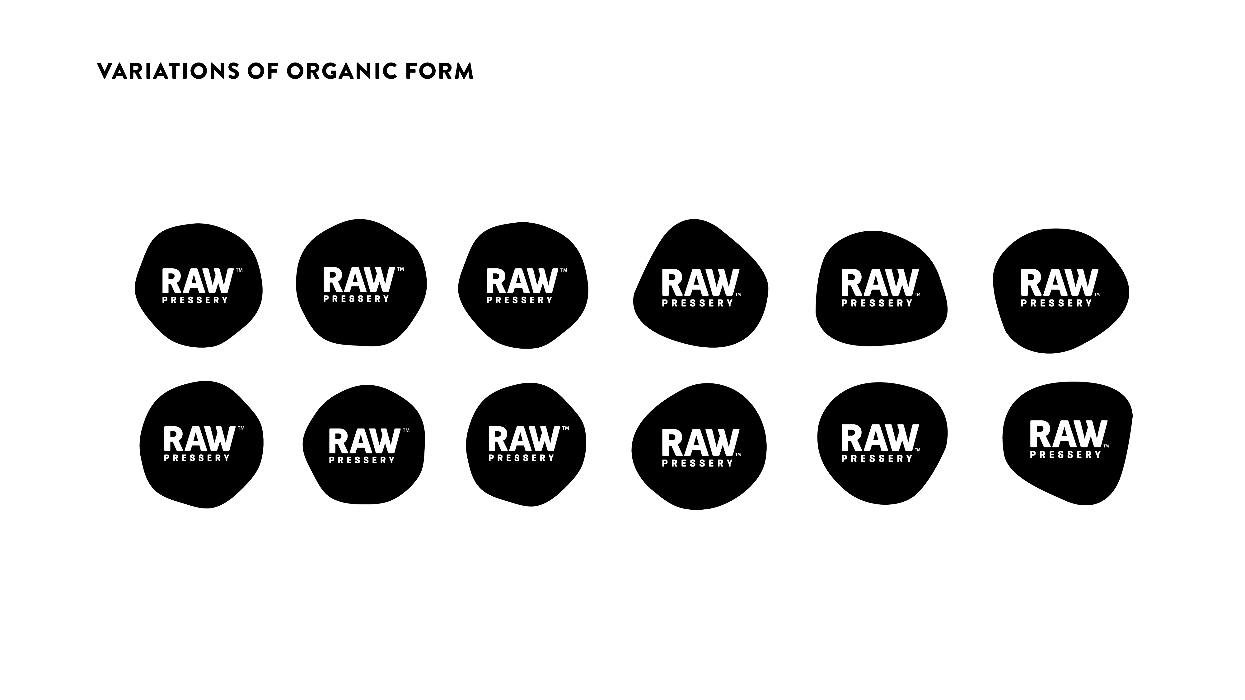
Our design team ideated an organic patch to depict a more fluid look that compliments the brand’s wide array of products in the drinks category. This unit is set to be used dynamically as it subtly changes in form, across various touch-points.
The unit is designed to be friendly for web-usage as the organic circle patch depicts motion, which can be translated in an animated ident for the brand.


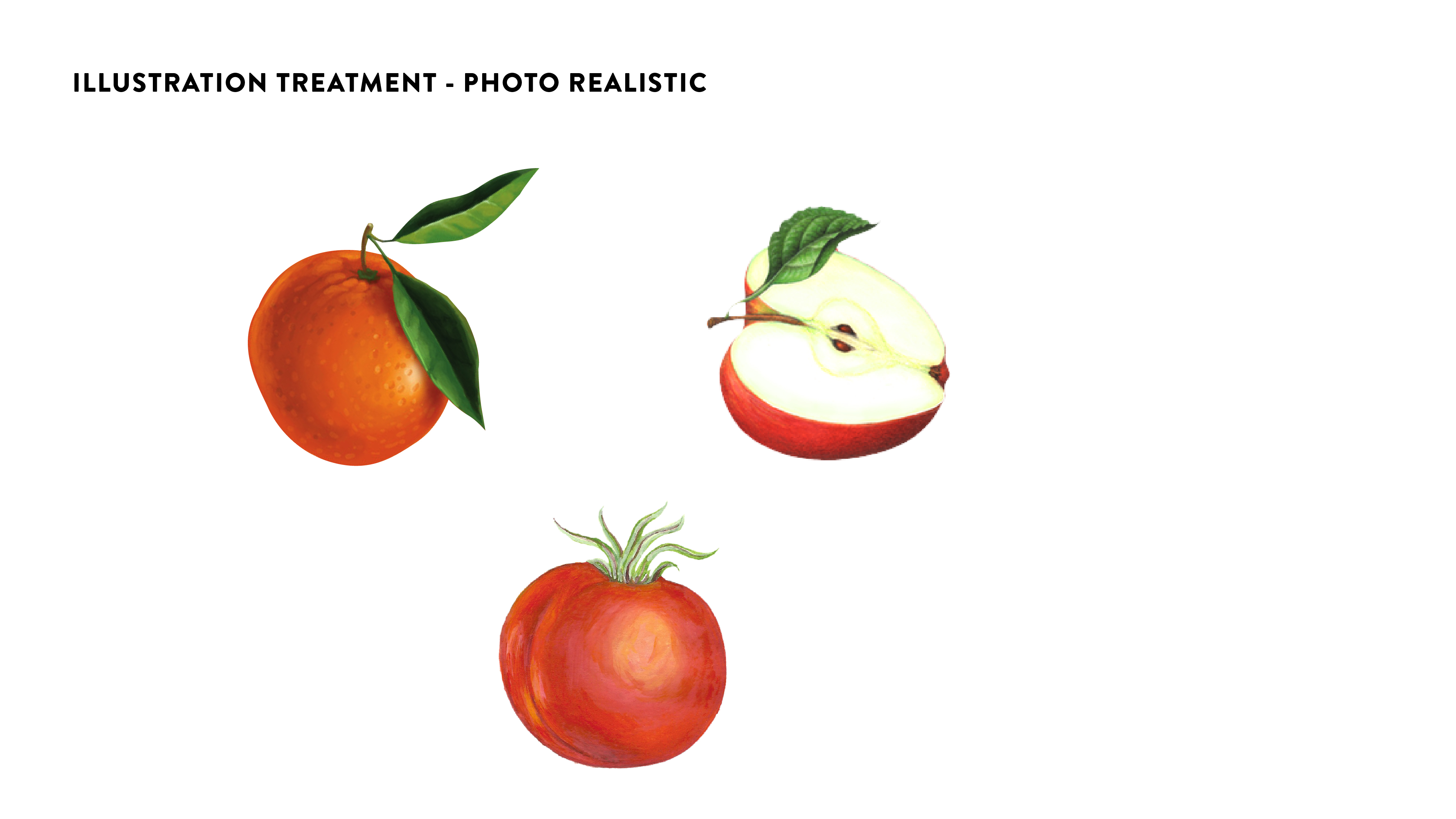
Illustration Treatment
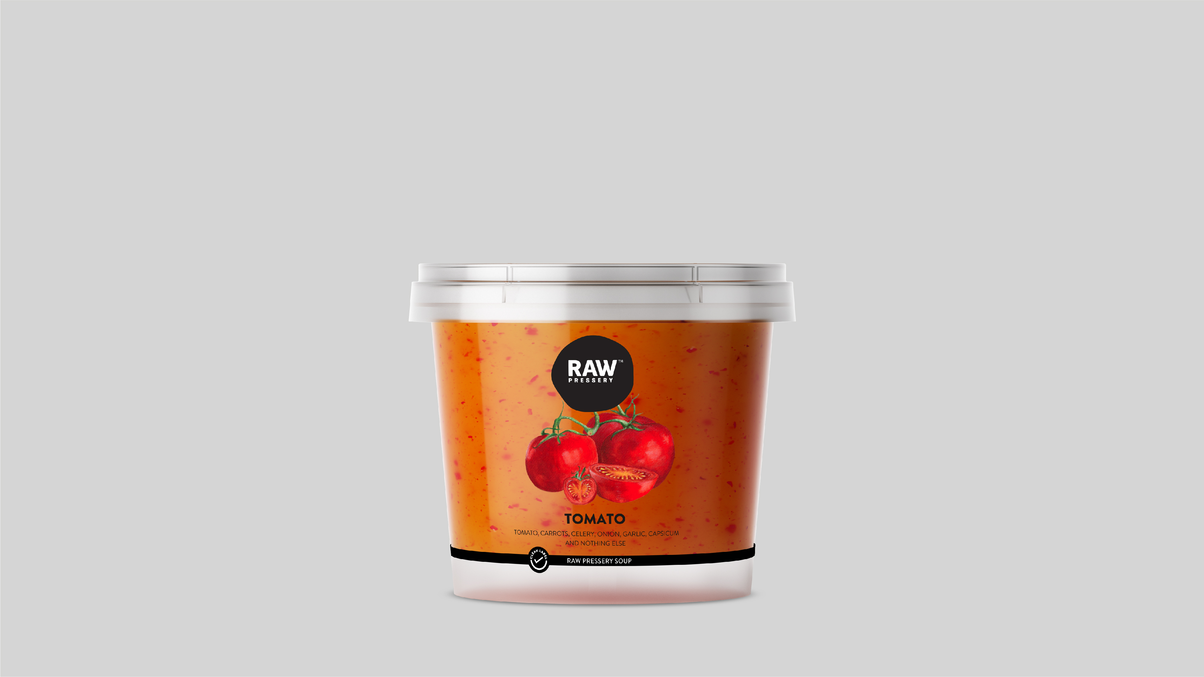
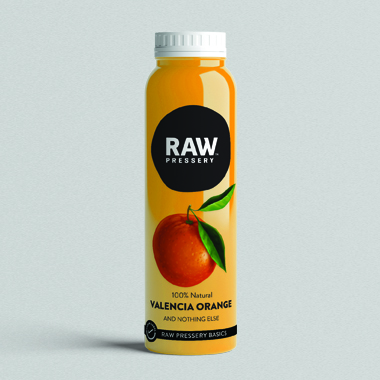
Raw’s fresh pressed juices are all natural, contains no sugar, no preservatives and the low shelf life due to natural ingredients was an obvious symbol of the company’s “Health First” philosophy. The entire system is based around developing and delivering the highest and freshest quality of drinks. To establish this more strongly, our design team created photorealistic illustrations of the main ingredients that goes into their respective drinks/juices, representing a direct visual graphic of what each product contains.
