Brand Approach and positioning
Branding and Visual Identity
Packaging and Collateral Design
Nicobar’s story begins at Good Earth, and at the crossroads of craft and community. Two decades later the time is ripe for the birth of a new brand: Nicobar. Two separate entities, each with its own voice, Good Earth and Nicobar share fundamental values, and both stem from a desire to shape culture in an original and inspiring way.
We were approached by Goodearth to conceptualise the new brand and develop the visual identity for the brand that speaks of these qualities and design specifics.
Collaborative and participative brand approach: We visualized Nicobar’s branding as a collaborative effort between the Nicobar Team, the audience and our agency. We can see how the Nicobar Team can setup the brand like a pot, providing its seeds and roots. The audience and the agency partake in the process of watering the foundation and giving it a wholesome proportion. This proportion is designed to evolve with time as the audience witness the growth and result of their participation.
Open ended design system – aimed to give opportunity to other designers/craftsmen to creatively work with – broadening overall design potential that stays true to the Nicobar brand identity – Building a design system that would enable other artists to creatively work with the brand’s key elements we have put in place.
Visual language
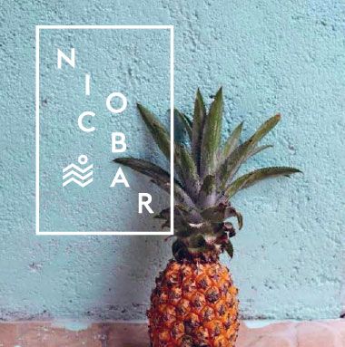
Inspired by the floating islands of Nicobar, our design team came up with a logo and type design that stays identical to the natural formation of the original islands. A clean and minimalist approach to build visual elements were extracted and ideated to complement the chosen typeface of the logo. We wanted to use fonts that were inspired by the logo which has a geometric quality, yet minimal and soft. This set of typeface and design elements were set to be used across the brand’s varied range of products and packaging.
Visual Identity
Nicobar is a state of mind: spontaneous, bright and enviably chic. Inspired by the tropical paradise of the same name, Nicobar aims to carve itself a unique aesthetic voice. It’s boundless spirit for adventure and discovery has translated into a lifestyle, tailor-made for the contemporary Indian. The brand highlights a modern India that embraces its rich traditions. Who-we-were mixed with who-we-are-now.Located in the Bay of Bengal, Andaman and Nicobar Islands is an archipelago consisting of about 600 islands.
For our design route, we wanted to focus on key elements of the brand’s identity that reflected serenity, simplicity and the overall tropical mood.
Iconography
Developed and derived from the brand identity, this set of minimalist iconography is a means to provide flexibility in various design forms and patterns that can be creatively used limitlessly when designing Nicobar products. The icons are representations of the key elements – Waves (water) – Stars – Trees – Direction arrows (travel)
Brand Application on mobile app and across social media platforms